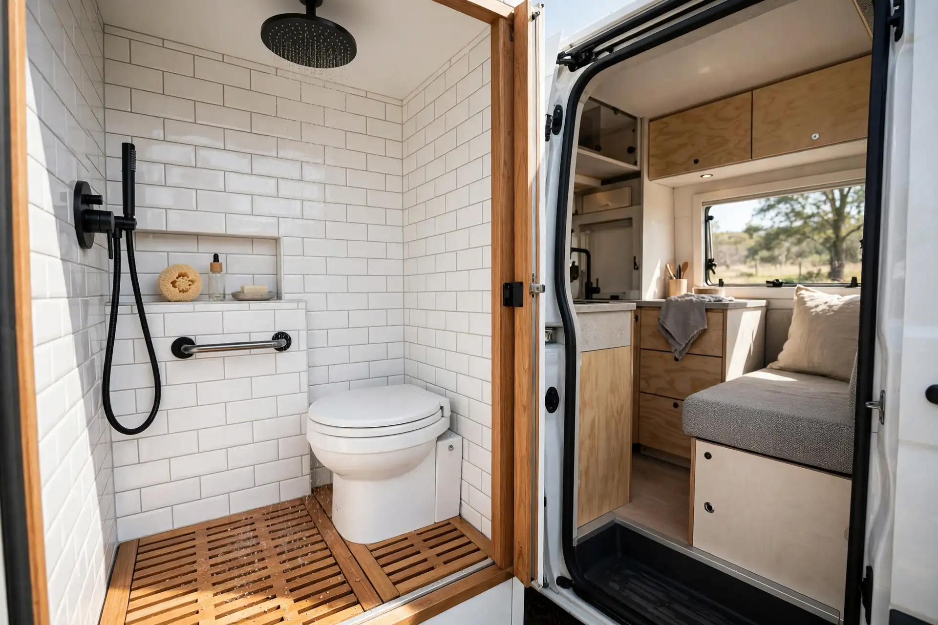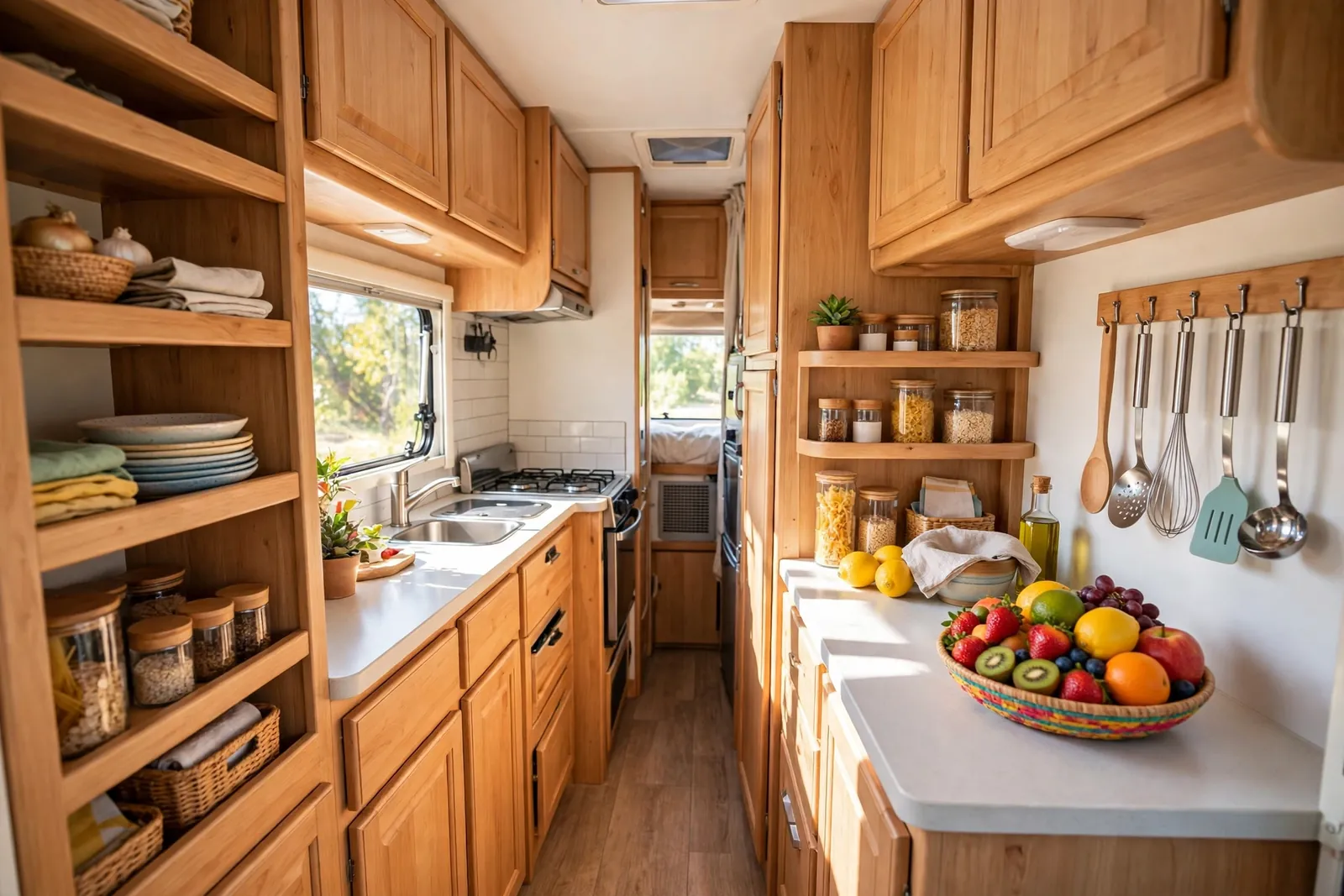
20+ Motorhome Interior Color Schemes That Fix the 1998 Look

You know the look the second you open the door. Flat beige carpet. Dark, shiny wood. Heavy curtains that block half the window. It all says 1998, even if the engine runs perfectly.
The good news is that color does most of the fixing. You do not need a full rebuild to make a motorhome feel current. A fresh cabinet color, lighter cushions, and a few warm wood tones can change the whole mood.
This list gives you 20 complete schemes to steal. Each one works in a small space. Each one is easy to picture in a real motorhome, not just a showroom.
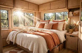
Pick the scheme that matches how you travel. Quiet weekends call for soft greens and creams. Long road trips might want something bolder, like navy or burnt orange. There is no wrong answer here, only the one you will still love in a year.
What Makes a Motorhome Look Like 1998?
The fix is simple. Lighten one big surface, add one warm accent, and let the windows do their job. Start with cabinets or cushions, not everything at once.
1. Warm Cream and Walnut
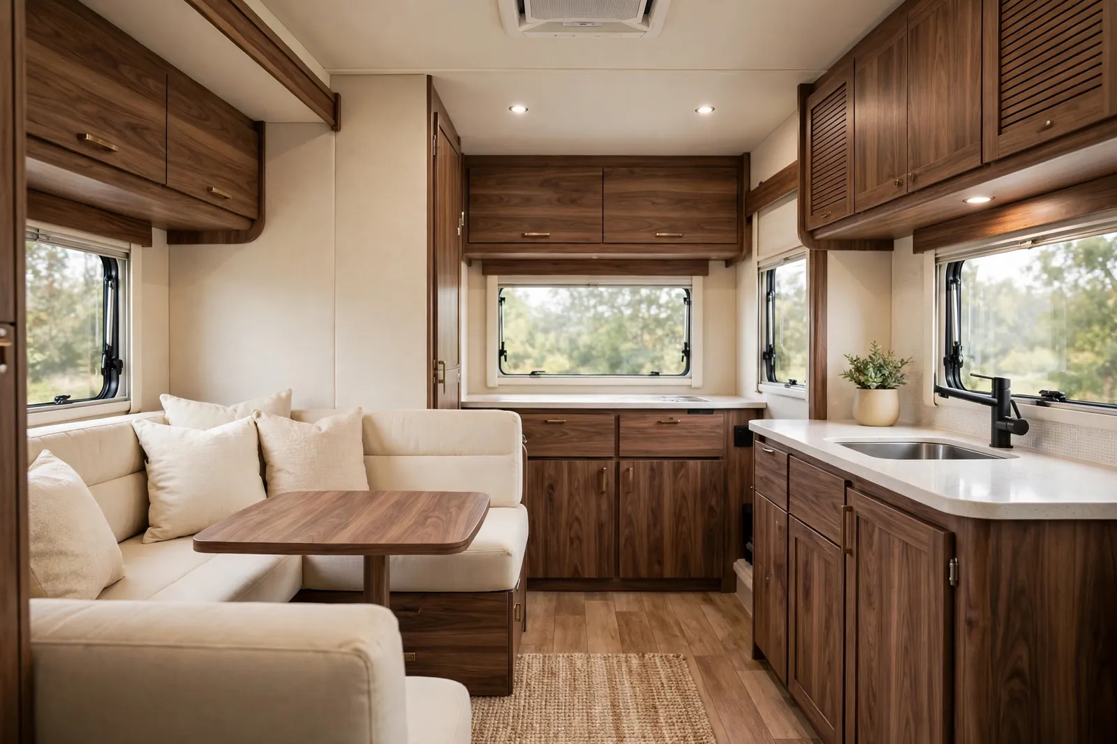
Warm cream is the easiest way to erase the 1998 look. It bounces light around a small space and makes the ceiling feel higher. Walnut keeps it from feeling cold or clinical.
Use cream on the walls and the main upholstery. Let walnut carry the cabinets, the table edge, and the trim. The contrast is soft, not sharp, so the whole space feels calm.
This scheme suits almost any motorhome. It works with existing light wood floors and it flatters both modern and classic layouts. If you only change one thing, paint the darkest cabinets cream and watch the space open up.
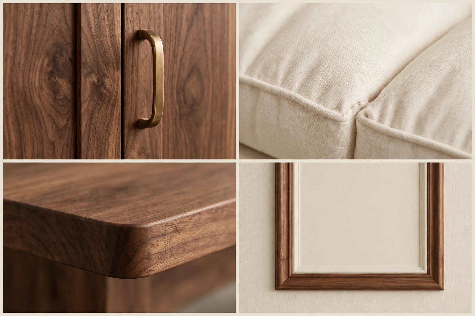
Keep the hardware simple. Slim brass or black pulls suit walnut well. Add a cream throw and one wooden tray to tie the seating area to the kitchen.
Avoid bright white here. Warm cream is kinder in the evening light and it hides dust on the road better too.
2. Sage Green and Natural Oak
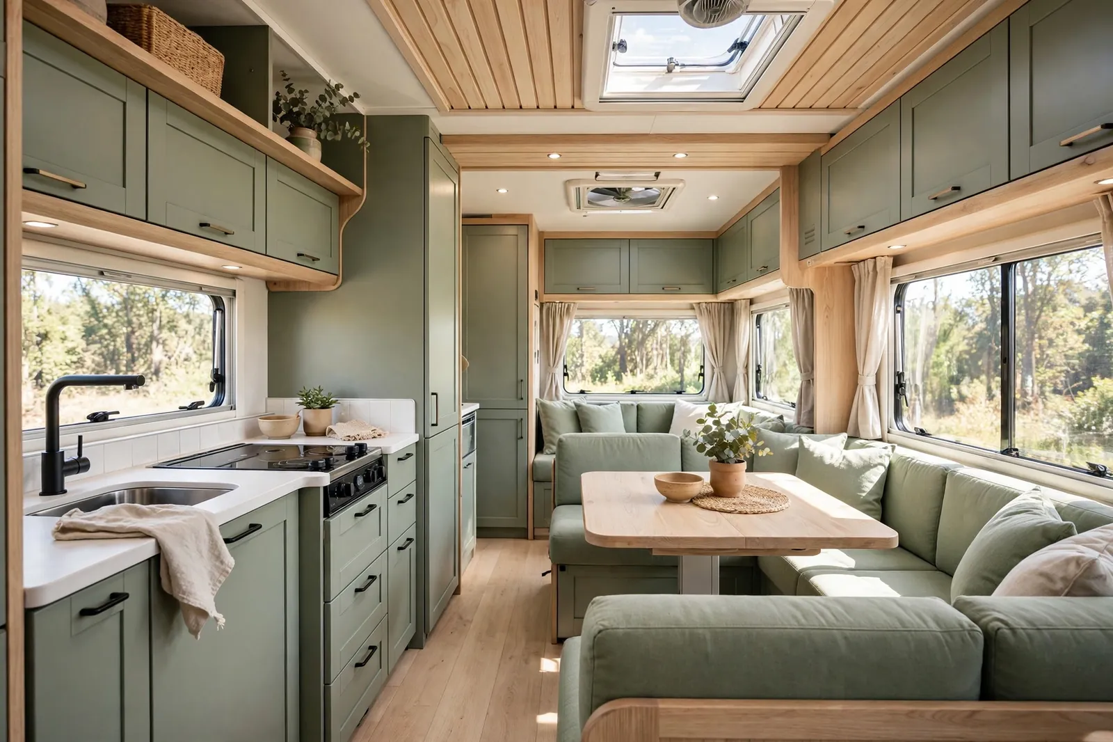
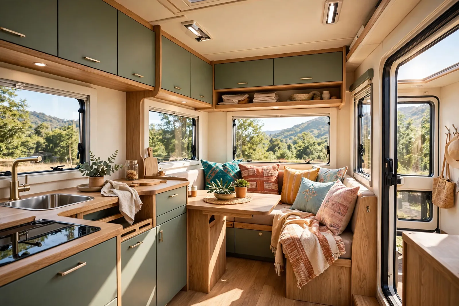
Sage green is quiet, fresh, and very forgiving. It reads as a color without shouting. Paired with pale oak, it feels like a calm cabin on wheels.
Paint the lower cabinets sage and leave the uppers light. That trick keeps the space bright while still giving you a clear color story. Oak brings warmth to the worktops and the table.
This is a great pick if you park near trees, lakes, or the coast. The green echoes the view outside, so the inside and outside feel connected. It also hides everyday marks better than plain white.
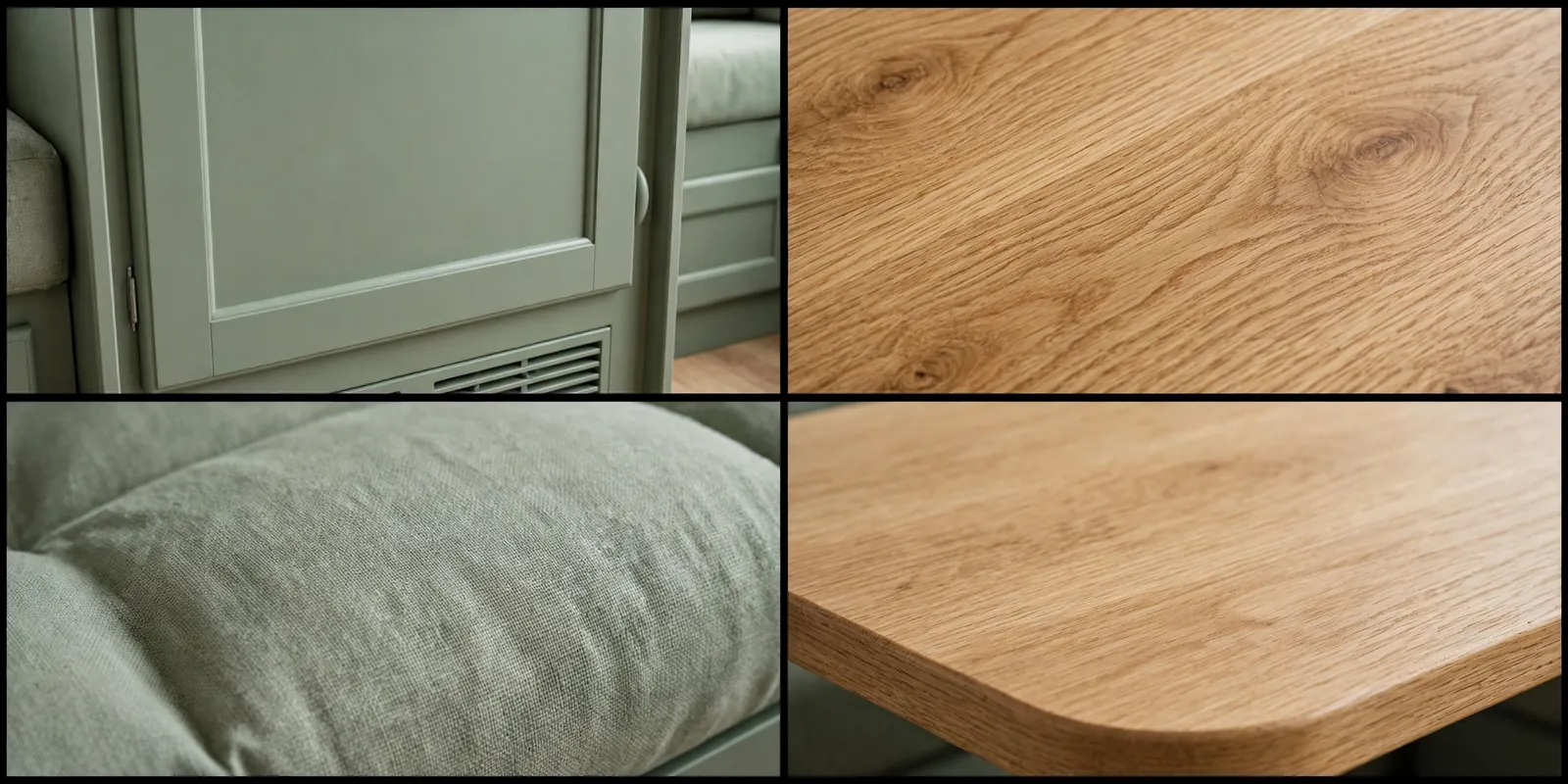
Try linen look cushions in sage and cream. A small plant on the table finishes the look, as long as you secure it before you drive.
Skip neon greens. The soft, greyish tone is what makes this scheme feel grown up.
3. Deep Navy and Brushed Brass
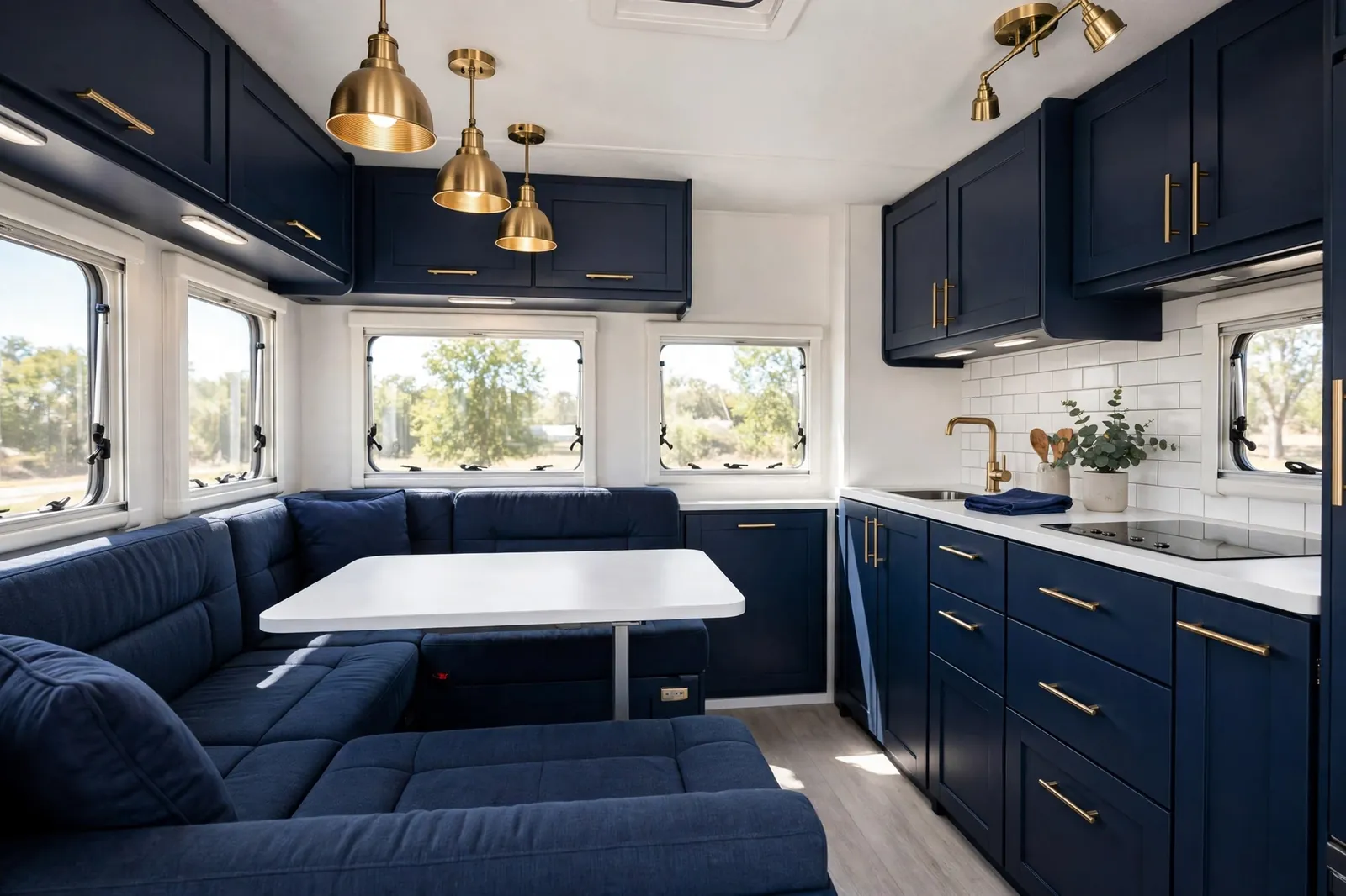
Navy gives a motorhome instant polish. It feels smart, like a small hotel room, and it pairs beautifully with warm metal. Brushed brass is the detail that lifts it from plain to special.
Use navy on the cabinets and the main sofa cushions. Keep the walls and worktops white so the space stays bright. Brass handles, a small lamp, and a faucet finish the story.
Be careful with navy in a very dark motorhome. You need good daylight or warm lighting, or the navy can feel heavy. Add a light rug and cream bedding to balance it.
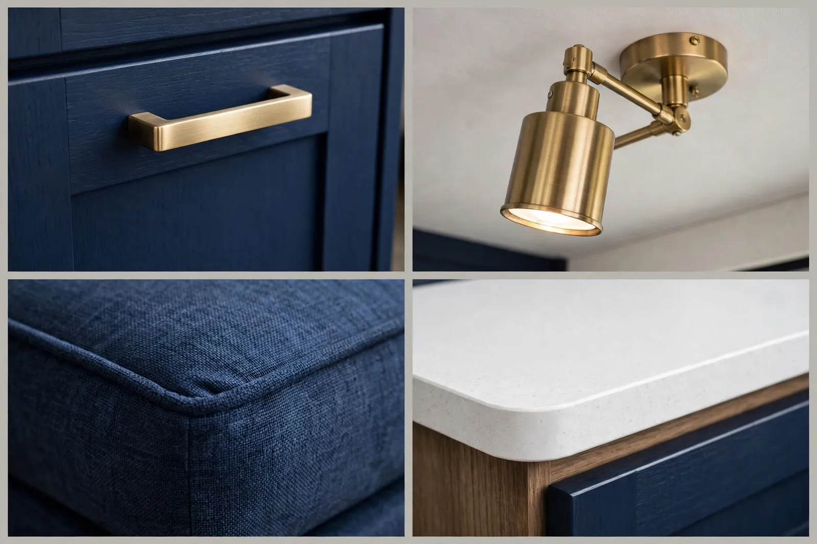
This scheme is ideal if you love a classic look with a modern edge. It photographs well too, which matters if you share your travels online.
Keep patterns simple. Stripes or small checks work. Big bold prints will fight with the navy.
4. Terracotta and Soft Cream
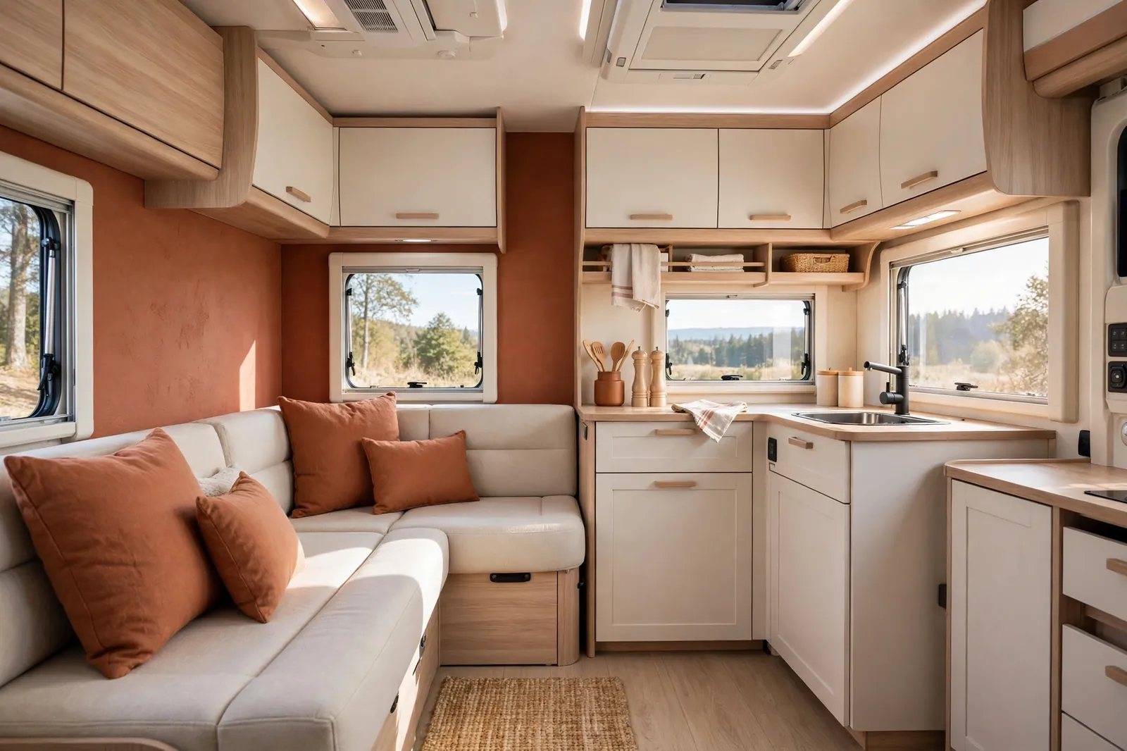
Terracotta brings warmth without going full orange. It feels sunny, earthy, and relaxed, like a long lunch in the south of France. Soft cream keeps it light.
Use terracotta for cushions, a throw, and one accent wall or splashback. Cream cabinets and bedding stop the warm tone from taking over. Light wood adds a natural middle step.
This scheme is perfect for warm climates and desert trips. It also looks wonderful in golden evening light, when the whole interior glows.
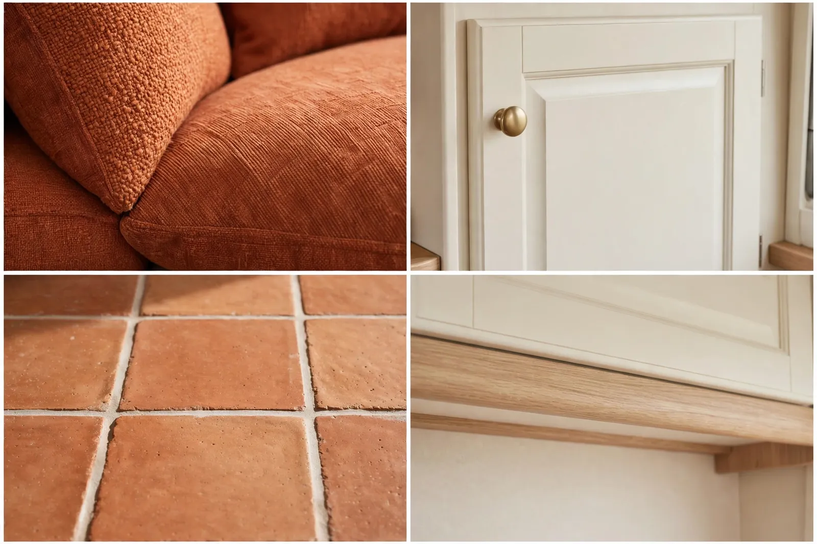
Clay pots, woven baskets, and cotton throws all suit this palette. Keep the shapes simple so the color can shine.
If your motorhome is small, use terracotta as an accent only. Too much of it in a tiny space can feel hot rather than cozy.
5. Charcoal and Mustard Yellow
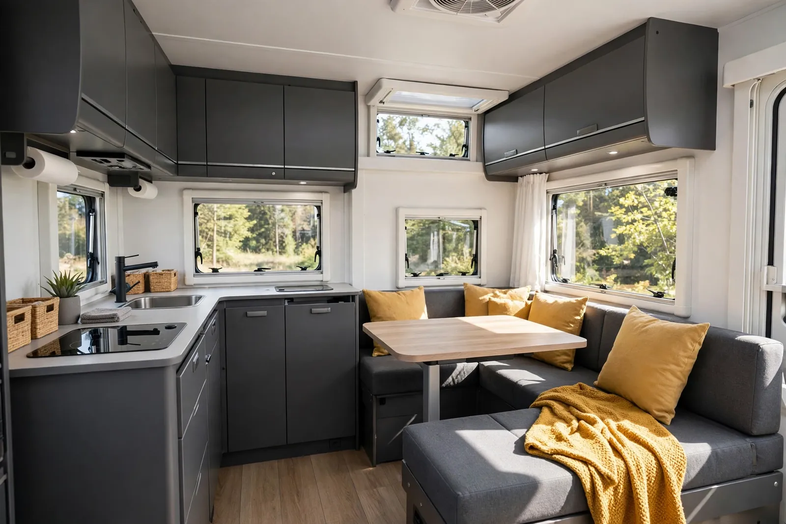
Charcoal and mustard is bold in the best way. The grey grounds the space. The mustard adds a jolt of energy, like sunlight on a grey day.
Charcoal works well on cabinets and the sofa base. Mustard belongs on cushions, a blanket, and maybe one chair. White walls keep the balance, so the dark tone never closes in.
This is a strong pick for couples or solo travelers who like a modern, graphic look. It also hides stains well, which is a real bonus on the road.
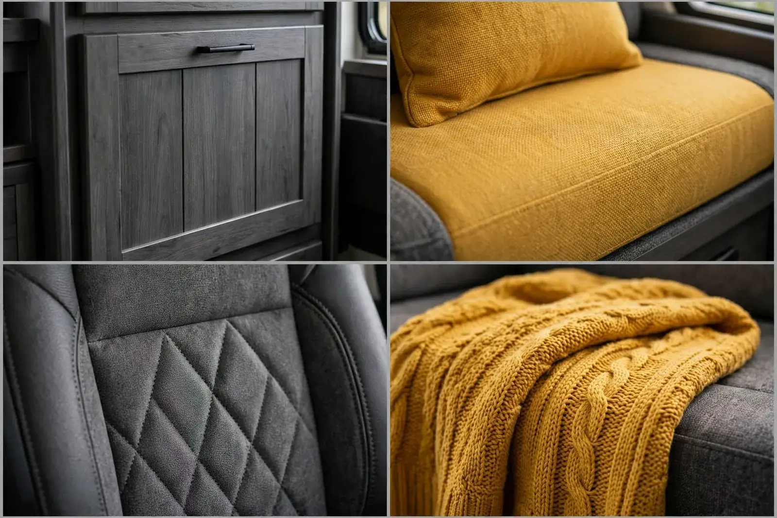
Keep the mustard to about one fifth of the space. That is enough to feel cheerful without feeling loud.
Add warm lighting in the evening. Cool white bulbs can make charcoal feel cold, while warm bulbs make it feel rich.
6. Coastal White and Sea Blue
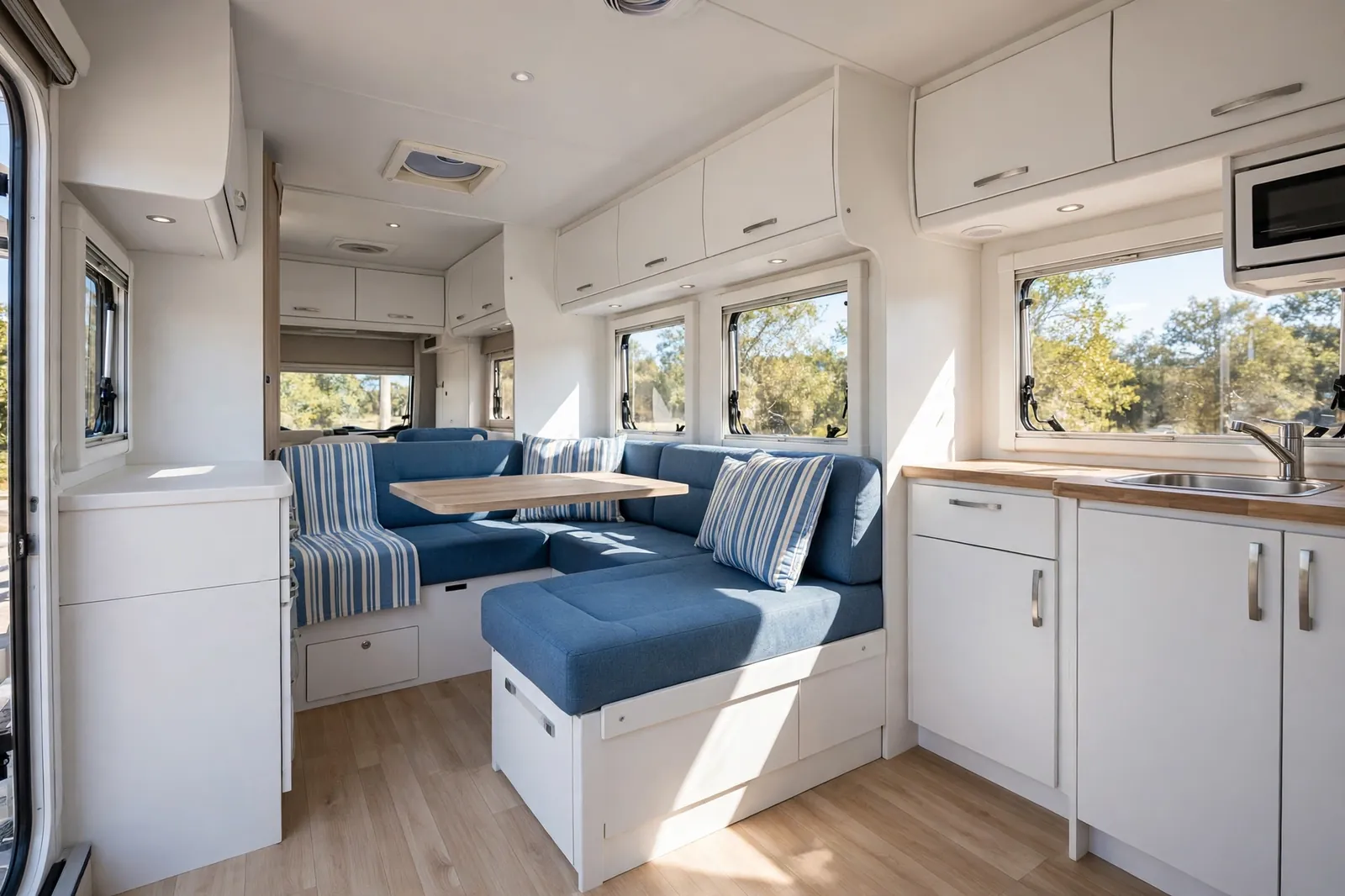
Coastal white and sea blue never go out of style. It feels clean, airy, and a little bit like a holiday, even on a rainy Tuesday. That is exactly what many motorhome owners want.
White cabinets and walls do the heavy lifting here. Sea blue cushions, a striped throw, and a few ceramic pieces add the coastal note. Light wood flooring warms the whole scheme.
This palette is best in a bright motorhome with big windows. If your windows are small, add mirrors and light fabrics to help the white work harder.
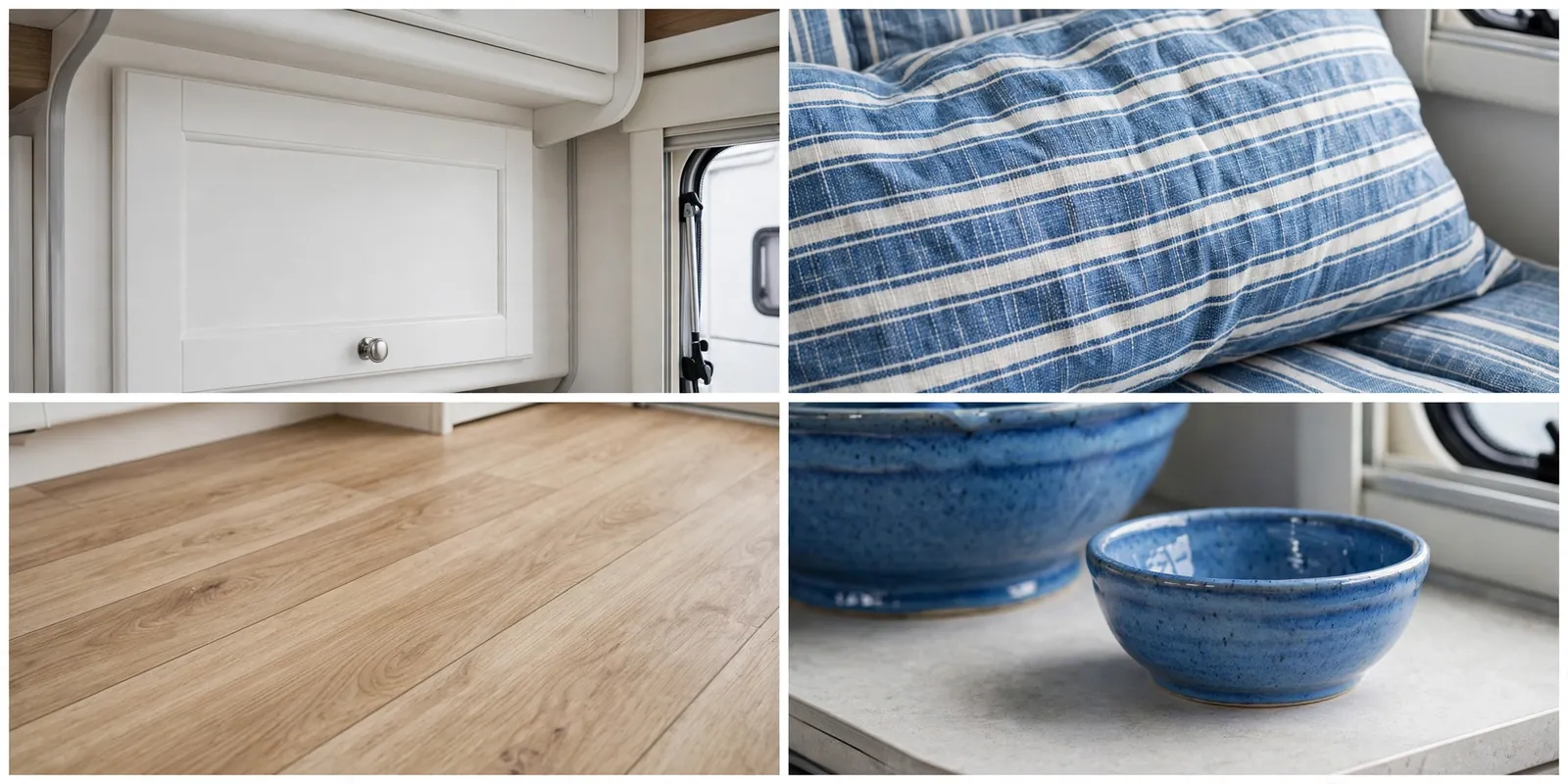
Stripes are your friend, but keep them thin. Thick navy stripes can feel like a theme park. Thin sea blue stripes feel like a beach house.
Rinse sandy feet at the door if you can. White looks wonderful, but it does show sand faster than darker schemes.
7. Blush Pink and Pale Grey
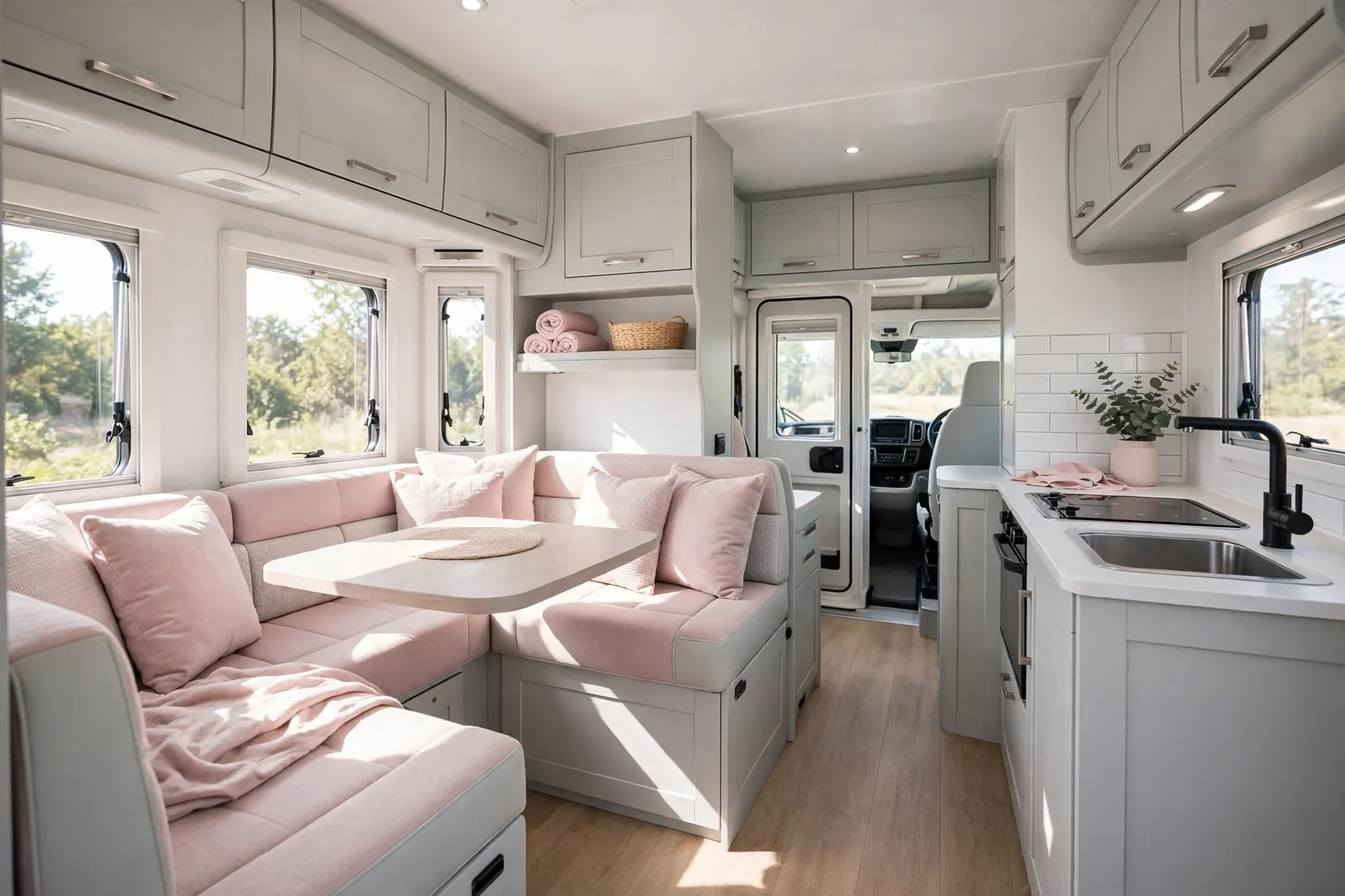
Blush pink is softer than it sounds. It is not bubblegum pink. It is the color of a pale rose, and it makes a small space feel gentle and welcoming.
Pair blush cushions and a throw with pale grey cabinets and upholstery. White walls keep it fresh. The result is calm, pretty, and easy to live with.
This scheme suits anyone who wants a motorhome that feels like a retreat. It works well with light wood and brushed nickel hardware. It also pairs nicely with plants and soft cotton bedding.
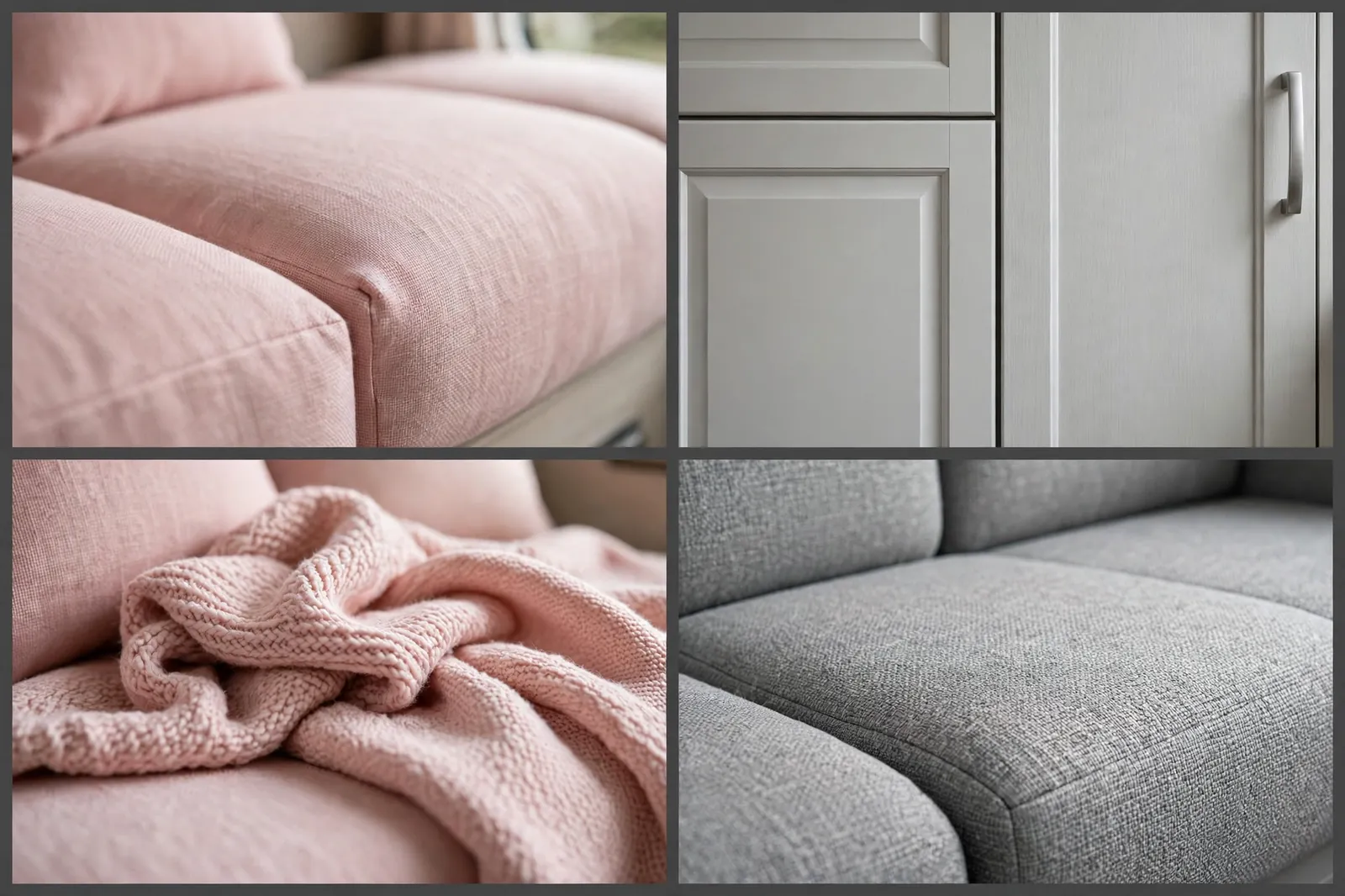
Keep the pink muted. If a cushion looks bright in the shop, it will look brighter in a small space. Choose the paler option when you are unsure.
Grey stops the pink from feeling too sweet. That balance is the whole trick.
8. Forest Green and Cognac Leather
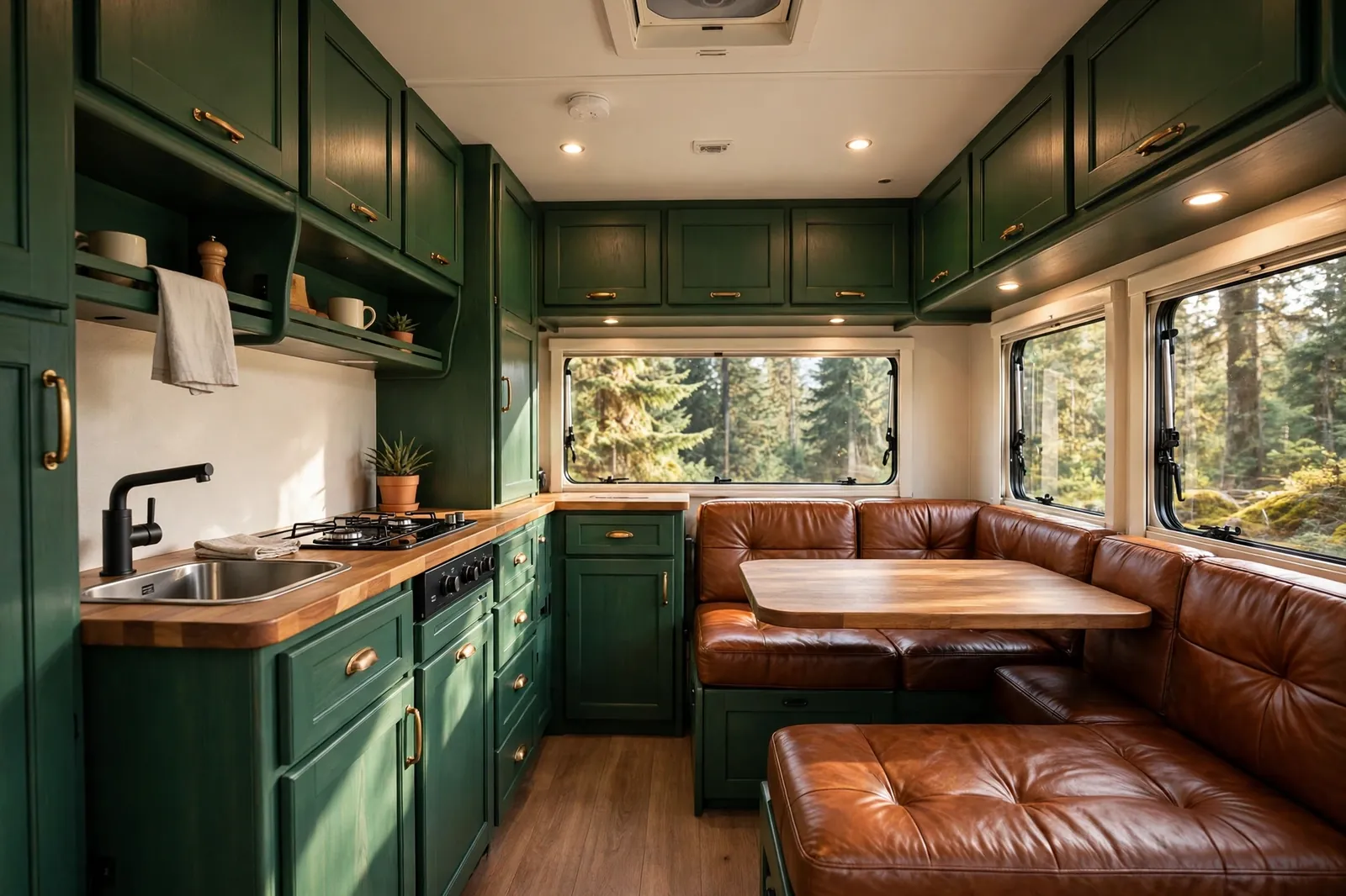
Forest green and cognac leather is a classic pairing for a reason. The green feels deep and woodsy. The leather feels warm and well traveled.
Use forest green on the cabinets and cream on the walls. Cognac leather on the dinette seats gives you a rich focal point. Brass or dark wood handles tie it together.
This scheme is wonderful for autumn trips and forest campsites. It also ages well, since leather gains character over time instead of looking worn out.
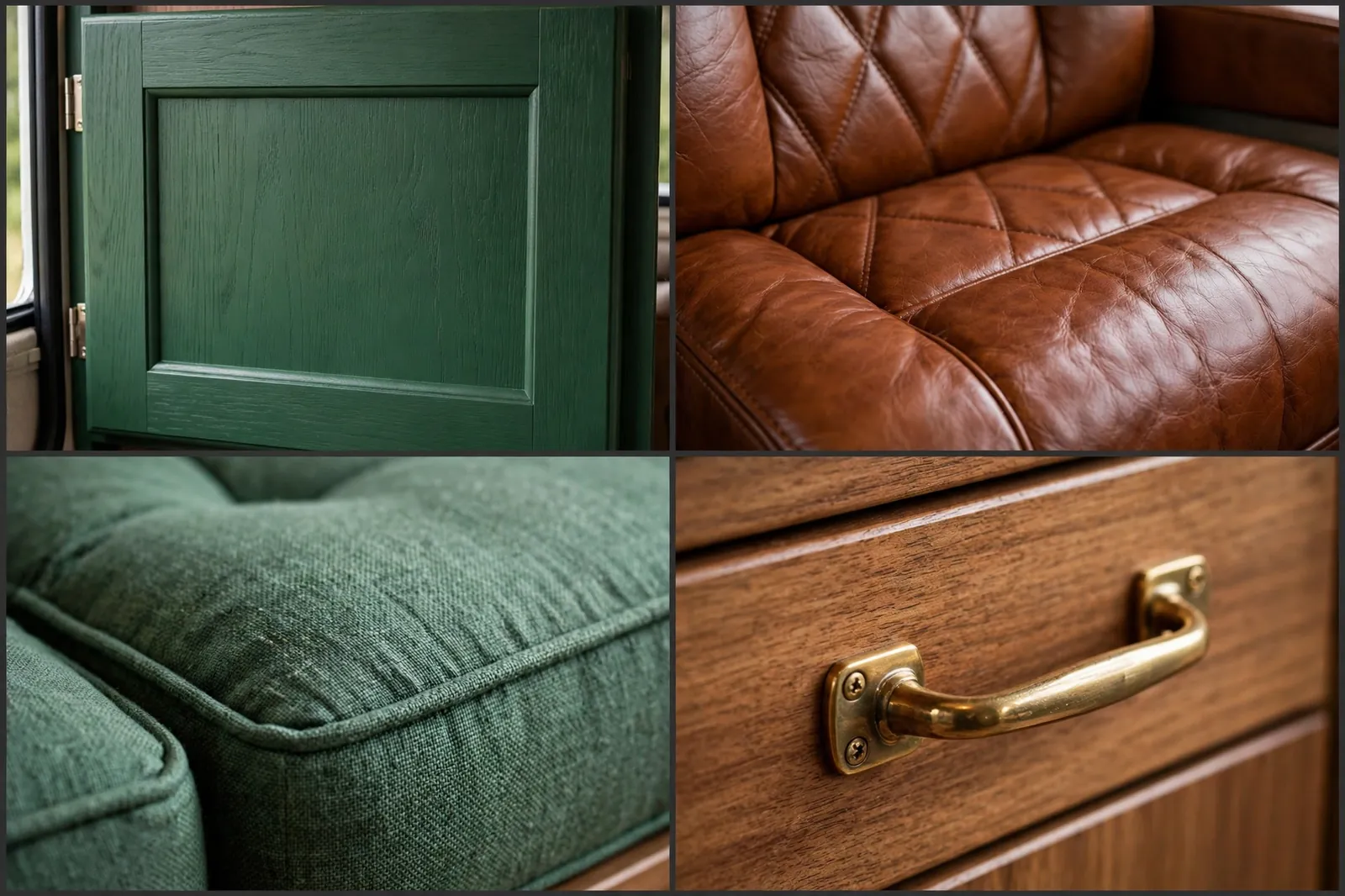
Leather needs a little care on the road. Wipe it down after dusty trips and keep it out of harsh direct sun when parked for weeks.
If real leather is out of budget, a good faux leather in the same warm brown works just as well visually.
9. Matte Black and Warm White
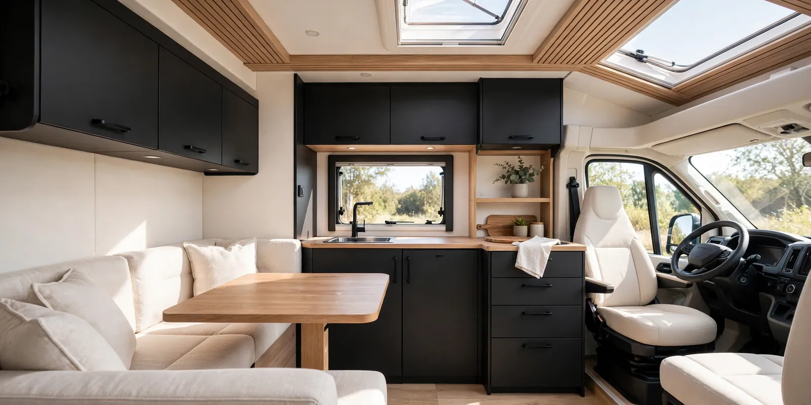
Matte black and warm white is the modern minimalist choice. It looks sharp, clean, and very current. The matte finish is key, since glossy black can feel harsh.
Black cabinets with warm white walls create a crisp contrast. Light wood softens the edges and stops the scheme from feeling stark. Keep decor minimal and let the contrast speak.
This palette needs good lighting. Warm white bulbs, under cabinet lights, and daylight all help. Without them, black can swallow a small space.
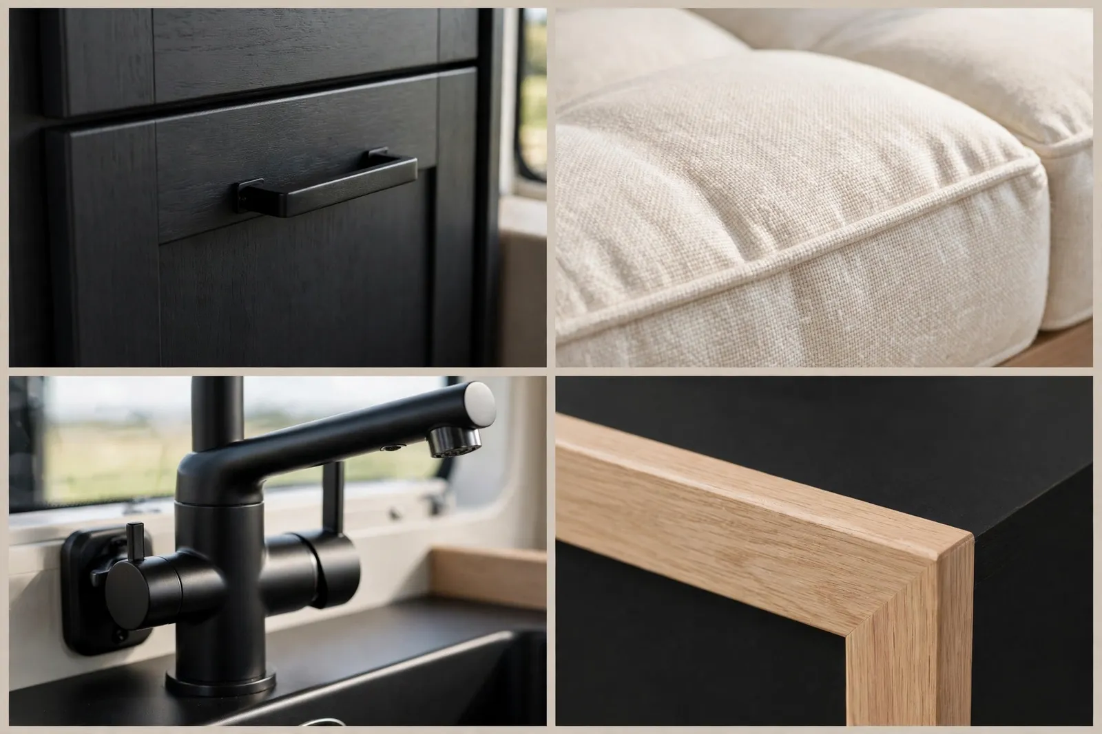
Fingerprints show on matte black, so keep a microfiber cloth handy. It is a small price for a look this clean.
Choose warm white, not icy white. The warmth is what makes this scheme feel like a home instead of a showroom.
10. Dusty Blue and Light Maple
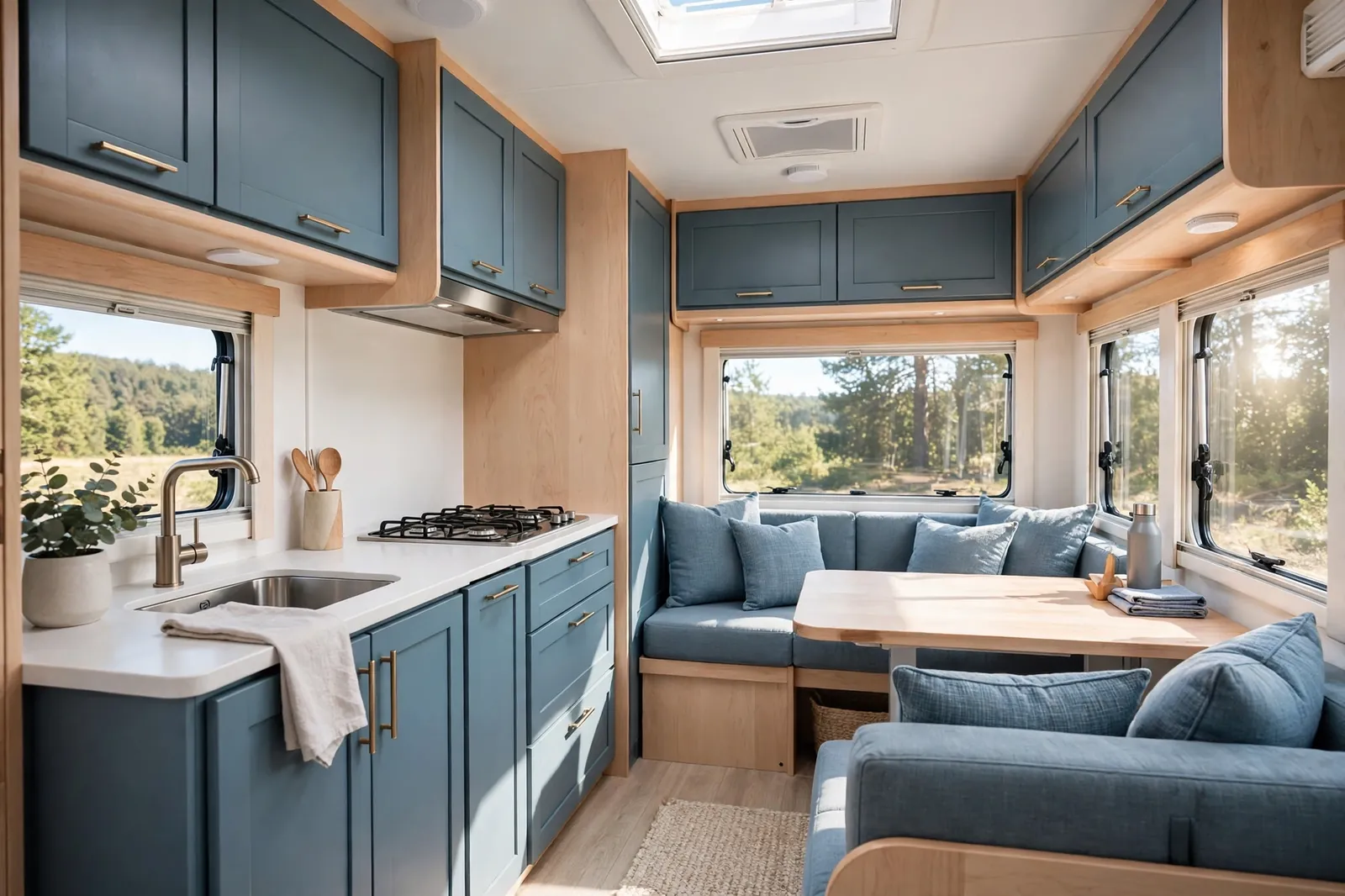
Dusty blue is blue with a little grey mixed in. That grey makes it calm instead of loud. With light maple, it feels fresh, soft, and a little bit Scandinavian.
Paint the cabinets dusty blue and let maple carry the worktops and table. White walls and bedding keep the space bright. The whole palette feels like a clear sky on a mild day.
This is a safe choice if you are nervous about color. It is clearly a color, but it never dominates the room. Guests will notice it feels nice without quite knowing why.
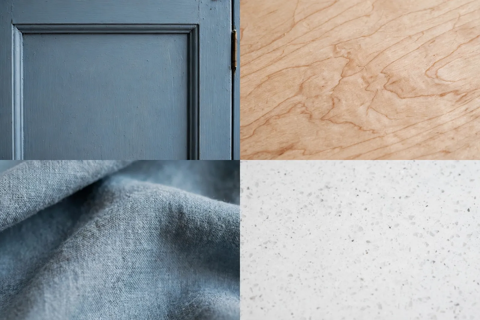
White ceramics and pale linen suit this scheme perfectly. Add one darker blue cushion for depth.
It works in both small and large motorhomes, which makes it a flexible pick if you change vehicles later.
Where to Spend First
Cushions give the fastest change for the lowest cost. Cabinet paint gives the biggest change. Handles and lighting are the small details that make both look finished.
11. Olive Green and Cream
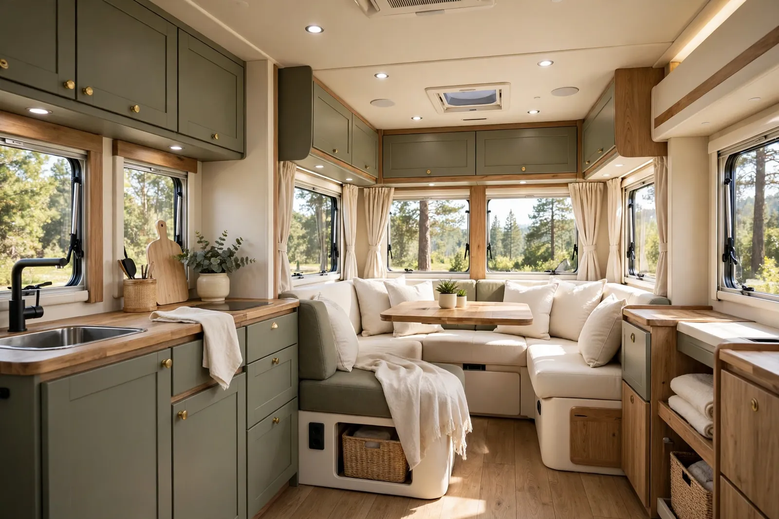
Olive green is earthy and relaxed. It is less bright than sage and a little deeper, which makes it feel grounded. Cream lifts it and keeps the space sunny.
Use olive on the cabinets and the main cushions. Cream walls, bedding, and curtains soften the whole look. Natural wood adds warmth without adding another color.
This scheme is ideal if you love nature but do not want a bright green. It blends with countryside views and it looks great with woven baskets and cotton throws.
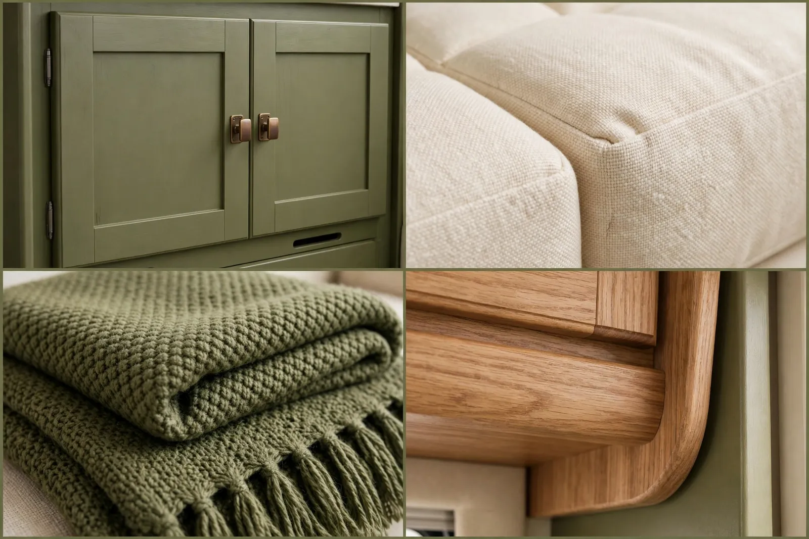
Keep the olive muted. A yellowish olive can look dated fast. A greyish olive looks modern and calm.
Add cream in at least three places, like bedding, cushions, and a rug, so the olive never feels heavy.
12. Burnt Orange and Charcoal
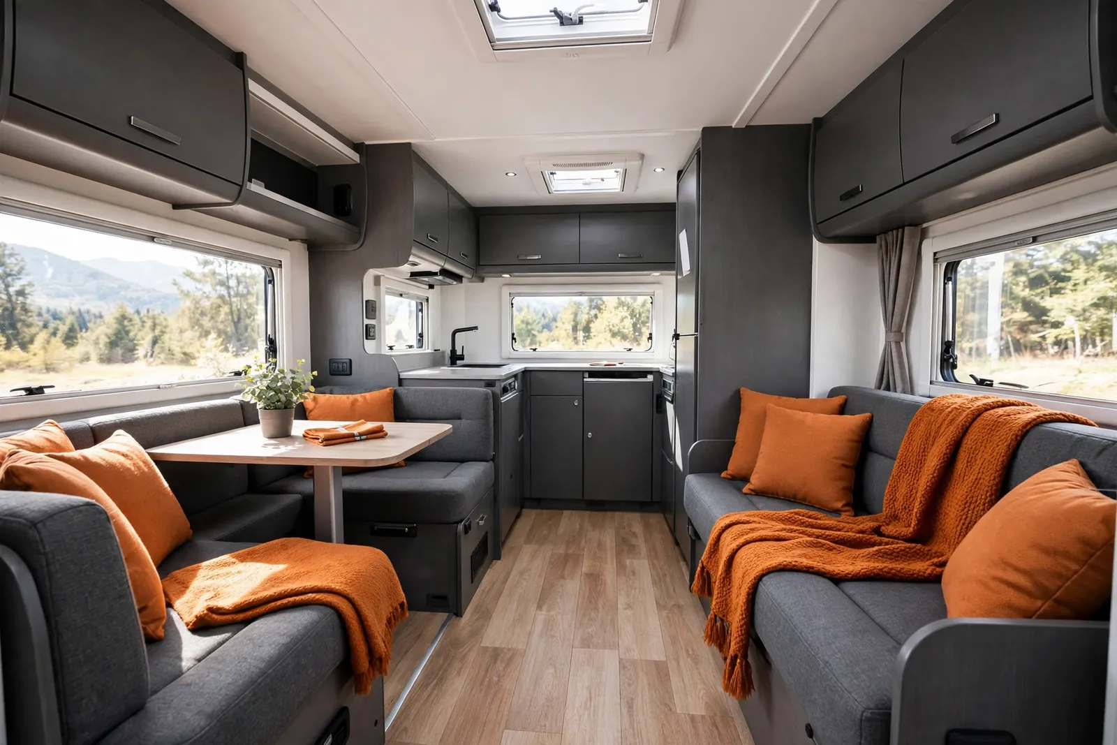
Burnt orange is autumn in a cushion. It is warm, rich, and full of energy. Charcoal keeps it grounded so it feels stylish rather than loud.
Charcoal cabinets and sofa bases set the stage. Burnt orange cushions, a throw, and a small rug add the warmth. White walls stop the dark and warm tones from closing in.
This is a great scheme for cooler climates and mountain trips. It feels cozy on a cold evening, especially with warm lighting and a hot drink in hand.
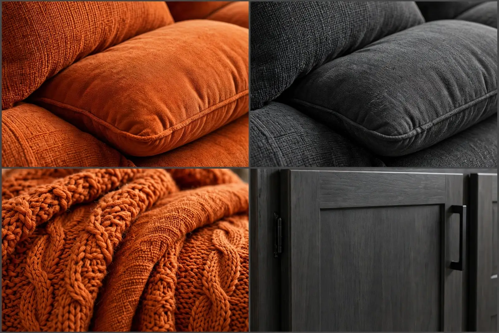
Use burnt orange as an accent, not a wall color. In a small space, a little goes a long way.
Wood tones suit this palette well. Walnut or dark oak both work, while pale wood can feel too light against the charcoal.
13. Sky Blue and Crisp White
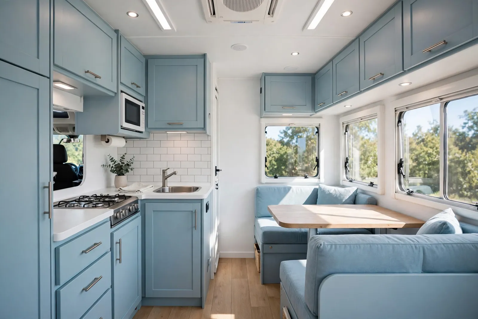
Sky blue and crisp white is pure fresh air. It feels light, clean, and optimistic, like the first day of a holiday. It is hard to feel gloomy in this palette.
White cabinets and walls carry the scheme. Sky blue cushions and a throw add the color. Light wood flooring adds just enough warmth to stop it feeling cold.
This palette shines in sunny climates. It also works well in smaller motorhomes, since light colors make tight spaces feel larger.
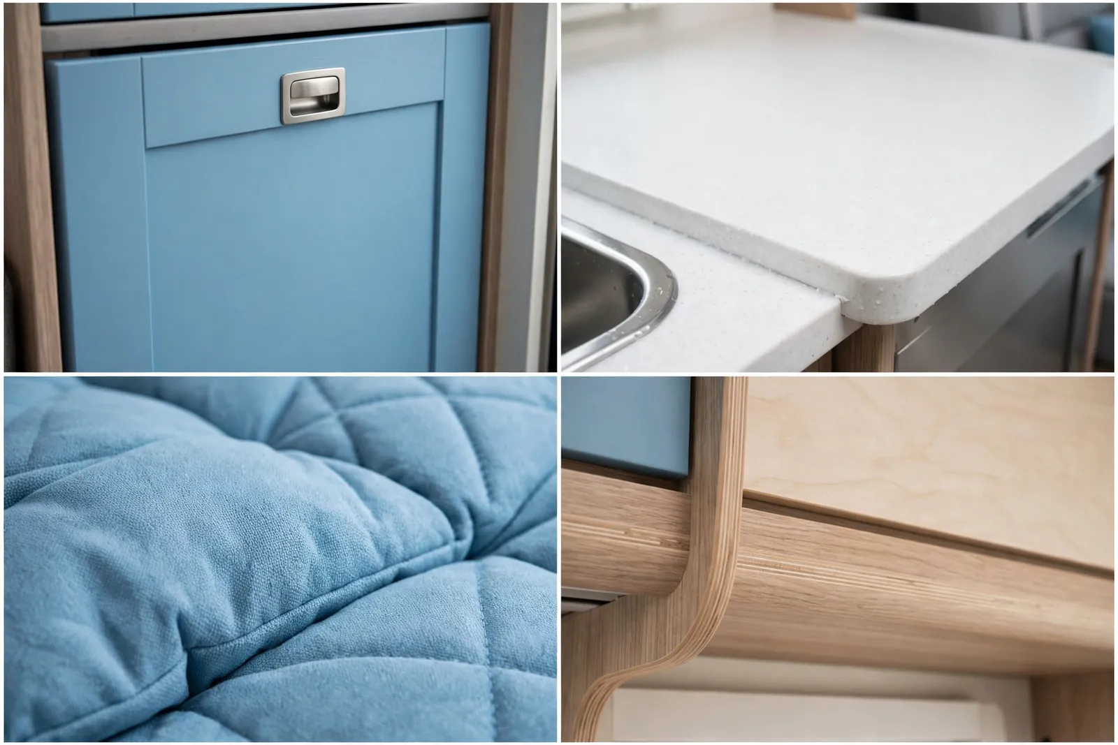
Keep the blue soft. A pale sky blue feels airy. A bright royal blue will dominate a small room fast.
White bedding with one blue accent cushion is all you need in the sleeping area.
14. Espresso and Ivory
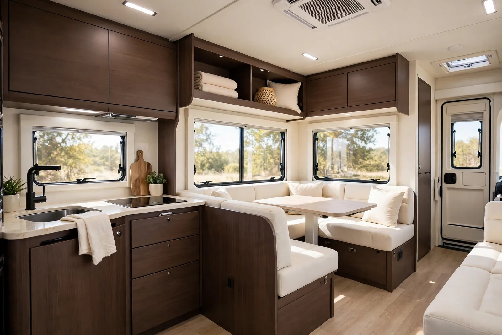
Espresso and ivory is the grown up version of brown and cream. The espresso is deep and rich, not flat or orange. The ivory is soft, not stark.
Use espresso wood on the cabinets and ivory on the walls and upholstery. Cream bedding and light curtains complete the look. The result feels warm, classic, and expensive.
This scheme works well if you already have dark wood you do not want to paint. Instead of fighting it, pair it with lots of ivory and good lighting.
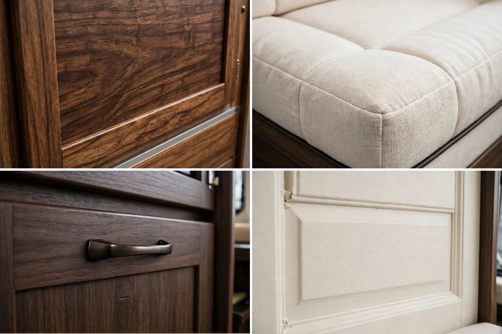
Lighting matters here. Warm bulbs and under cabinet lights keep espresso wood rich instead of dark.
Add a light rug in the living area. It breaks up the dark floor and lightens the whole space.
15. Teal and Warm Sand
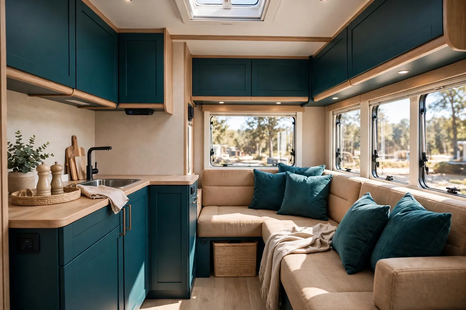
Teal is a bold choice that still feels calm. It sits between blue and green, so it suits both coastal and countryside trips. Warm sand keeps it earthy.
Teal cabinets with sand colored walls and cushions create a lovely balance. Light wood adds a natural bridge between the two tones. The space feels both colorful and relaxed.
This palette is perfect if you want color but you are tired of plain blue or green. Teal feels a little more special, a little more designed.
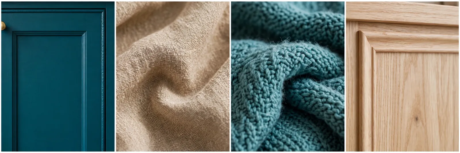
Use teal on the lower cabinets only if your motorhome is dark. That keeps the upper half light and airy.
Sand colored linen and a woven rug finish the look without adding another strong color.
16. Lavender Grey and White
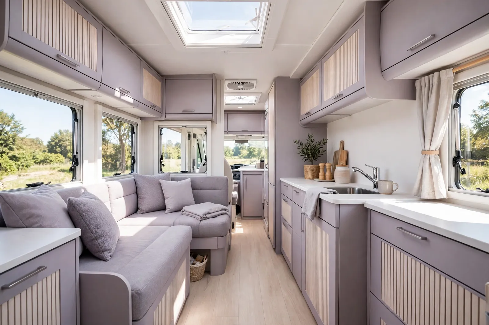
Lavender grey is a gentle surprise. It is grey with a whisper of purple, which makes it feel soft and a little bit dreamy. White keeps it crisp.
Use lavender grey on the cabinets and cushions. White walls and worktops stop it from feeling dull. Pale wood adds warmth and a natural touch.
This scheme is lovely for slow mornings and quiet campsites. It feels calm without feeling boring, and it pairs well with soft lighting.
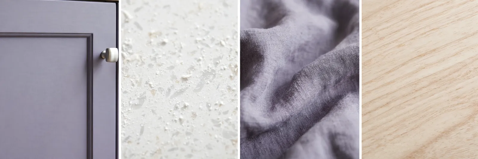
Keep the lavender very pale. A strong purple will take over a small space. The pale version is what makes this scheme work.
Silver or brushed nickel hardware suits this palette better than brass, which can clash with the cool tone.
17. Hunter Green and Cream
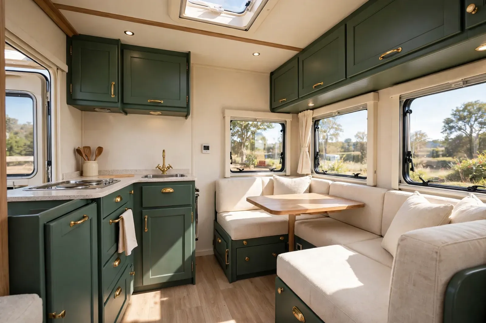
Hunter green is a timeless classic. It feels like a country house, a library, or a favorite old jacket. Cream softens it and keeps it bright.
Paint the cabinets hunter green and use cream on the walls and bedding. Brass handles add a traditional touch. The result is elegant without feeling fussy.
This scheme suits larger motorhomes and classic layouts. It also looks wonderful with wood paneling and traditional fabrics like checks and stripes.
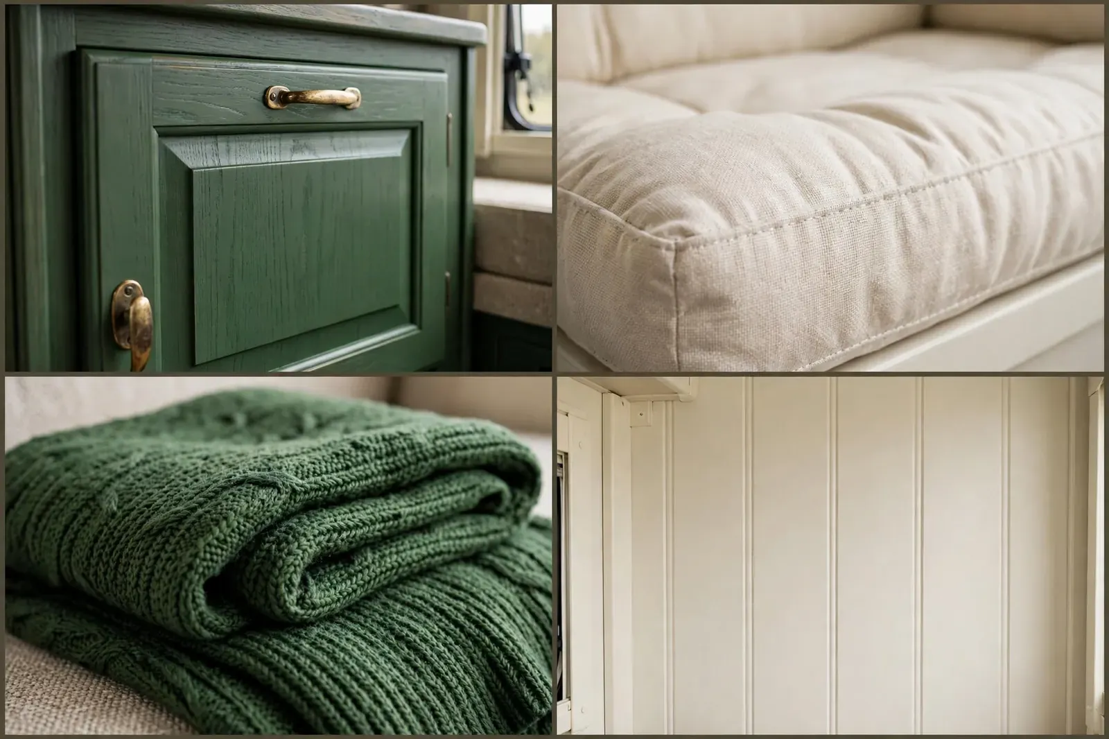
Good lighting is essential. Hunter green can look almost black in a dim motorhome, so add warm lights and light curtains.
Cream cushions on a green sofa give you the classic contrast that makes this palette sing.
18. Coral and Warm White
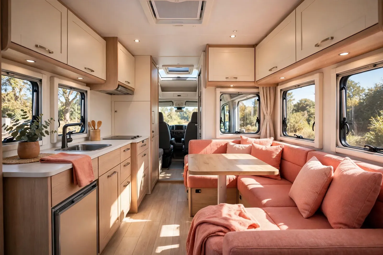
Coral is cheerful without being childish. It is pink with a warm orange heart, and it instantly lifts a room. Warm white keeps it soft.
Use coral on cushions, a throw, and a few small accessories. Warm white cabinets and walls carry the rest. Light wood flooring adds a sunny, natural base.
This scheme is perfect for summer trips and coastal campsites. It feels like sunshine, even when the weather does not cooperate.
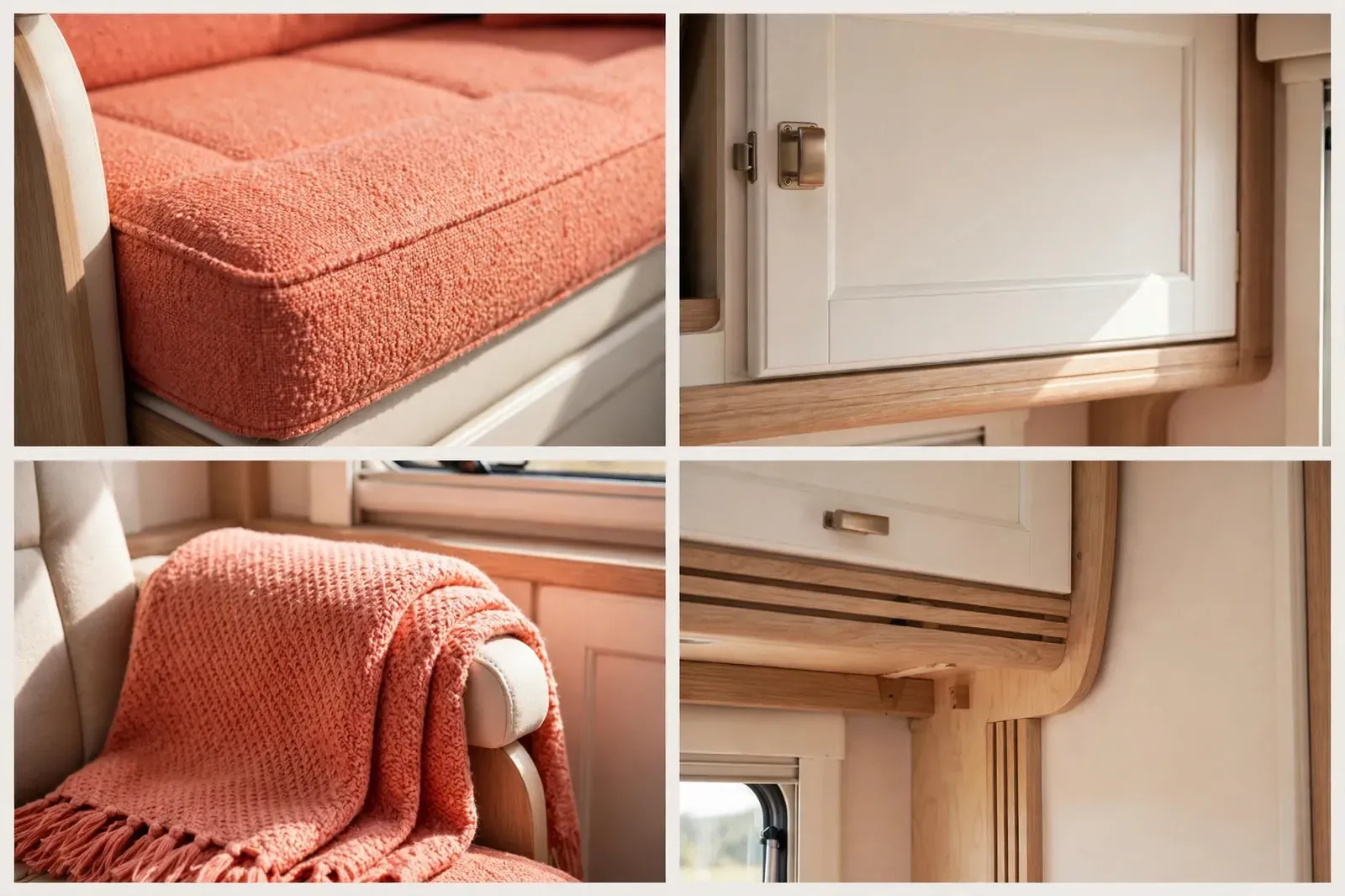
Keep coral as an accent. A coral sofa in a tiny motorhome can overwhelm the space. Coral cushions give you the joy without the risk.
Pair it with natural textures like cotton, linen, and rattan for a relaxed holiday feel.
19. Slate Grey and Lemon Yellow
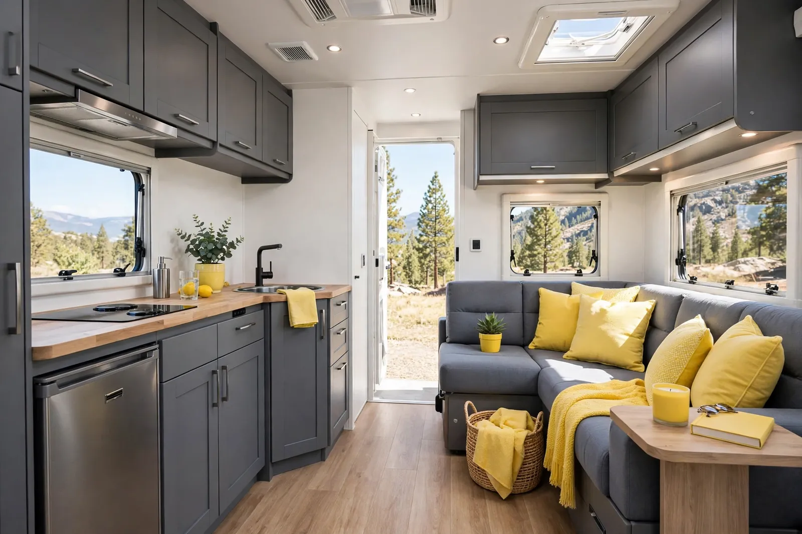
Slate grey and lemon yellow is a modern classic. The grey is calm and smart. The lemon is fresh and full of energy, like a slice of citrus on a grey day.
Slate grey cabinets and sofa bases ground the space. Lemon cushions and a throw add the pop. White walls keep everything bright and balanced.
This palette is great for year round travel. It feels fresh in summer and cheerful in winter, which is rare for one scheme.
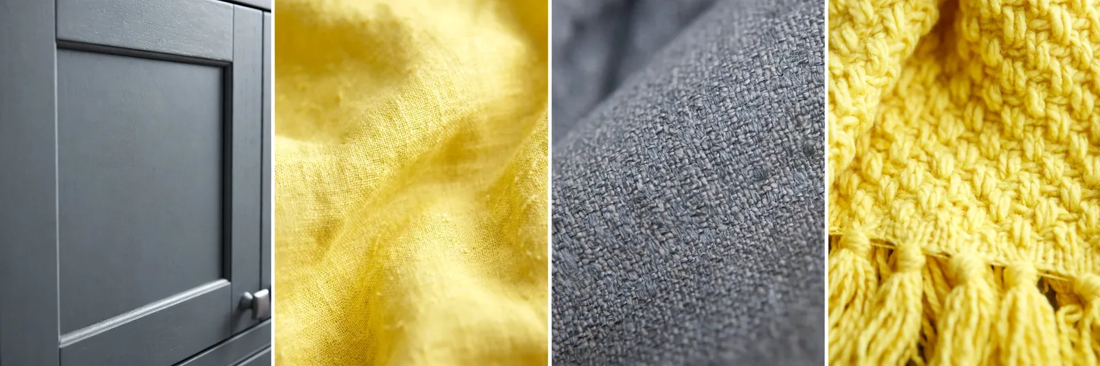
Use lemon sparingly. Two or three lemon pieces are enough. More than that can feel like a lemonade stand.
Grey bedding with one lemon cushion is a simple way to carry the scheme into the sleeping area.
20. Nordic White and Pale Wood
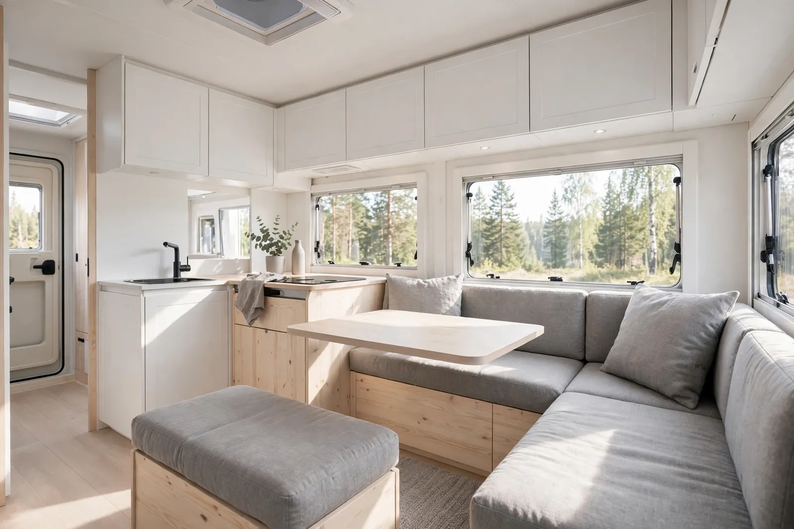
Nordic white and pale wood is the lightest scheme on this list. It is all about air, light, and simplicity. Nothing shouts. Everything breathes.
White cabinets, white walls, and pale wood floors and worktops create a calm, open space. Soft grey cushions add just enough contrast. The result feels like a Scandinavian cabin.
This scheme is ideal for small motorhomes, since light colors make tight spaces feel bigger. It also suits anyone who loves a clean, uncluttered look.
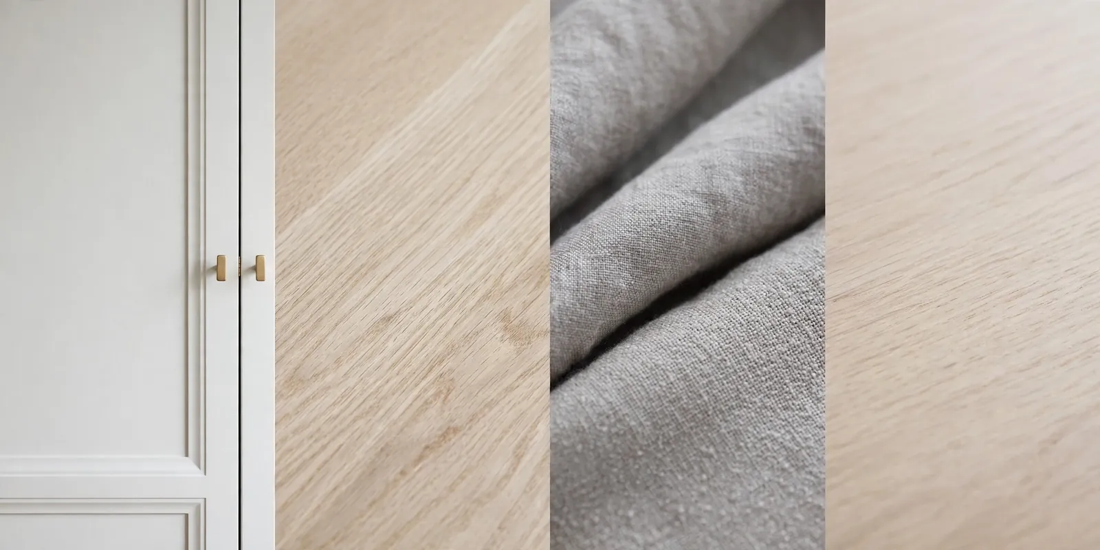
Storage is your best friend here. A cluttered white space looks messy fast, so use baskets and closed cabinets to keep things tidy.
Add texture through wool throws, linen cushions, and a woven rug, so the white never feels flat.
Before You Paint Your Cabinets: 5 Checks
Rushing the prep is the most common mistake. A well prepared cabinet paint job can last for years on the road. A rushed one chips in weeks.
Fixing the 1998 look is mostly about light and warmth. You do not need to replace everything. You need one clear color story and the courage to let go of the beige.
Start small if you are unsure. Change the cushions first, live with them for a trip, and see how the space feels. Then paint the cabinets when you are ready.
Whatever scheme you pick, keep the windows clear, the lighting warm, and the clutter low. Those three habits make any color scheme look better.
Your motorhome already takes you to beautiful places. Now the inside can feel just as good as the view outside.